The Illuminator’s Palette
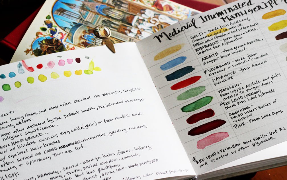
Painted palette of colors used in Medieval Illuminated Manuscripts
Illuminated manuscripts were one of the first historical art works that really pulled me in. I think it’s because of my love for both decorative type and color, along with the fanciful borders, plants and creatures that can be found surrounding the text. Yes, much of it is religious, but those monks who worked in scriptoriums sometimes had a sense of humor too.
However, in this post, I’m just looking at the palette of the Medieval Illuminated Manuscript:)
The Living Colors of Medieval Illuminated Manuscripts
To open a medieval illuminated manuscript is to step into a world where color was precious, symbolic, and almost alchemical. These were not merely decorations added to text, but carefully considered visual languages crafted from minerals, plants, insects, and metal, each chosen for its meaning as much as its beauty.
Illumination was laborious, expensive, and slow. Pigments had to be sourced, ground, mixed, tested, and layered with patience and reverence. Every hue carried weight. To the medieval eye, color was not ornamental—it was spiritual, intellectual, and alive.
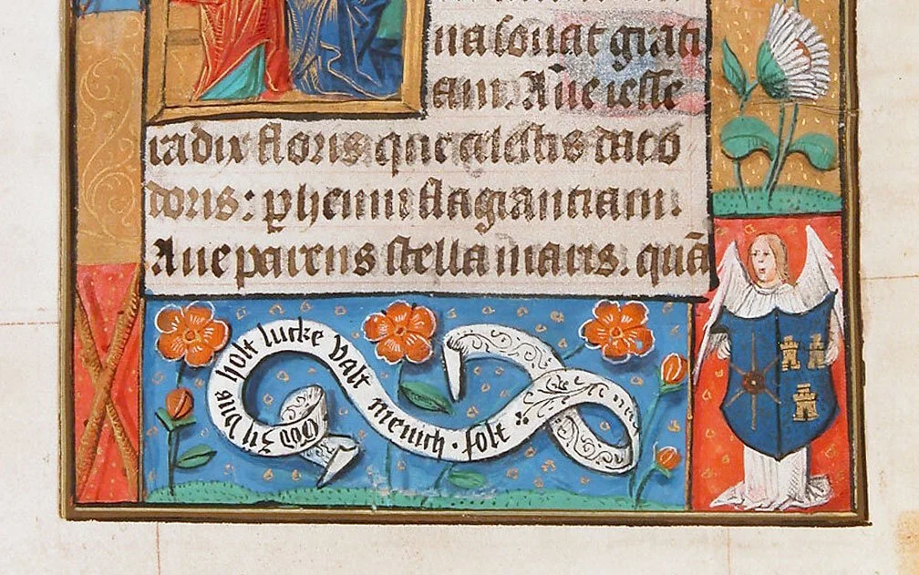
A detail from a leaf in a Netherlandish Book of Hours, 15th C, Met Museum.
A Palette Drawn from Earth and Sky
The blues of medieval manuscripts remain some of the most arresting ever produced. The most prized was ultramarine, derived from lapis lazuli imported from what is now Afghanistan. Its cost often exceeded that of gold, and it was reserved for the most sacred passages—most notably the robes of the Virgin Mary. Cheaper blues, such as azurite, were more common but lacked ultramarine’s depth and permanence.
Reds ranged from the earthy warmth of red ochre to the brilliance of vermilion, made from cinnabar, a mercury sulfide. Even more vivid was carmine, derived from crushed kermes insects. This luminous red conveyed authority, vitality, and divine love.
Greens were notoriously unstable. Verdigris, produced by exposing copper to vinegar vapors, offered a bright, acidic green that could corrode the parchment beneath it over time. Safer alternatives included green earth pigments, which produced softer, mossy tones—less dramatic, but more enduring.
Yellows and golds illuminated manuscripts both literally and symbolically. Orpiment, a striking arsenic-based yellow, was dangerous to handle but prized for its intensity. Gold itself—applied as powdered pigment or thin leaf—was used not simply to shine, but to suggest divine light beyond earthly color.
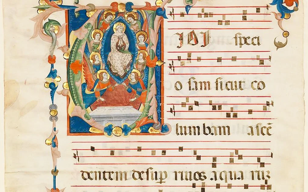
Detail from a manuscript leaf from an Antiphonary (a liturgical book for use by a choir)
Gold as Light, Not Decoration
Gold leaf was the defining feature of illumination. Applied over a raised ground of gesso or bole, it was polished until it reflected light like a mirror. In candlelit scriptoria, these surfaces would flicker and glow, animating the page.
Gold did not represent wealth alone—it stood for eternity, heaven, and the uncreated light of God. To illuminate a text was, quite literally, to fill it with light.
The Work of the Scriptorium
Manuscripts were produced in scriptoria—quiet rooms in monasteries or workshops—where scribes, rubricators, and illuminators worked collaboratively. Text came first, carefully ruled and written. Only then were spaces left for decoration, initials, borders, and miniatures.
Pigments were bound using substances such as egg white (glair), egg yolk (tempera), or gum arabic. Each pigment required a different binder and handling method, knowledge passed down through practice rather than written instruction.
Mistakes were costly. A misapplied color or cracked gold leaf could mean weeks of lost labor.
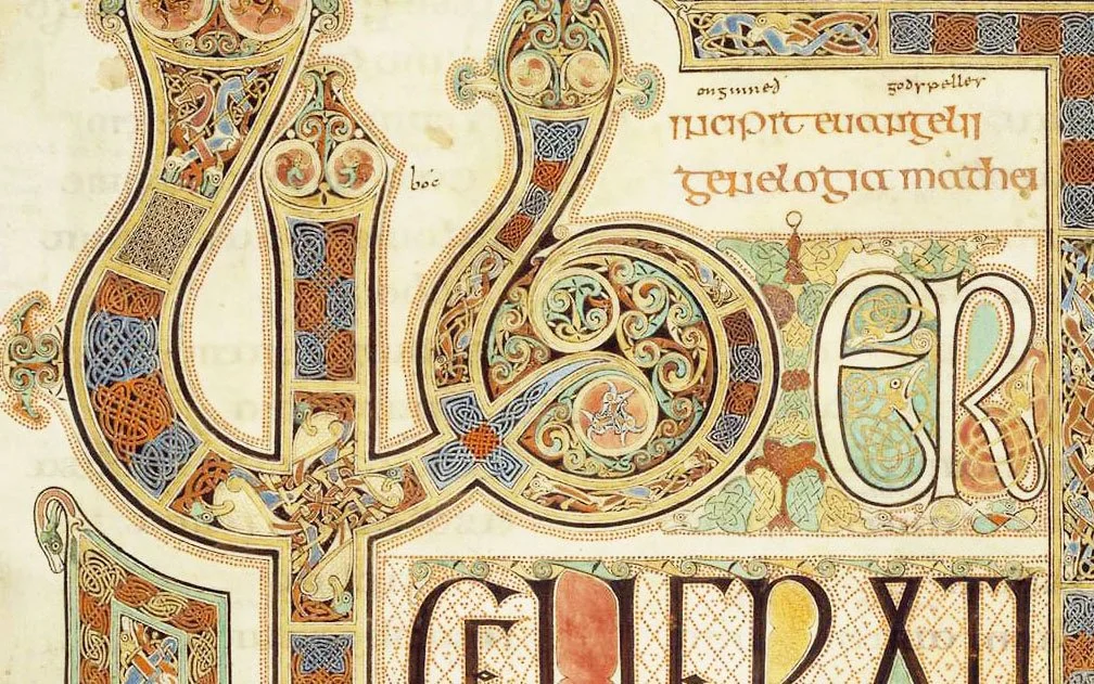
Detail from the highly decorated Lindisfarne Gospels of the British Isles, now in the British Library. Illuminated in the 7-8th c.
Meaning Encoded in Color
Color in medieval manuscripts was never arbitrary. Blue suggested the heavenly realm. Red spoke of power, martyrdom, and love. Green evoked renewal and resurrection. Purple—rare and imperial—signaled authority and sacred rule. Even the absence of color could be meaningful, creating visual pauses within the text.
In masterpieces such as the Lindisfarne Gospels, color, pattern, and sacred geometry merge into pages that feel less written than woven—interlaced like prayer itself.
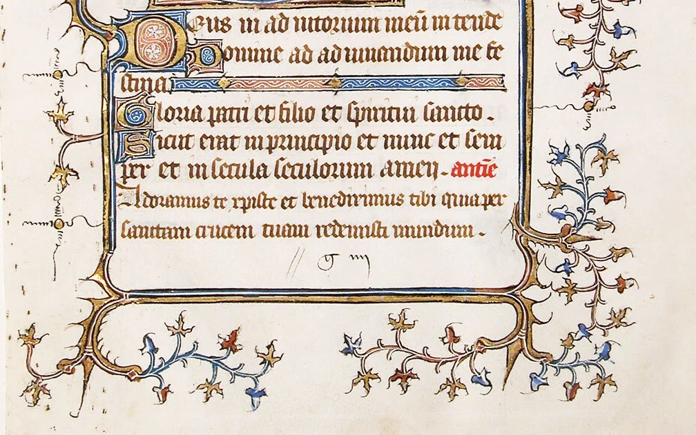
Detail from a French manuscript, 14th c. Met Museum
A Legacy That Still Breathes
What makes medieval illuminated manuscripts so compelling today is not only their beauty, but their humanity. Every brushstroke records a decision made by hand. Every imperfect line reminds us that these objects were crafted slowly, thoughtfully, and with devotion.
In an age of instant color and endless reproduction, these manuscripts invite us to pause—to consider pigment as substance, color as meaning, and decoration as devotion.
To live medieval-adjacent, perhaps, is to remember that color once mattered enough to cross continents, to risk poison, and to be laid gently onto parchment one luminous page at a time.